Wednesday 30 November 2016

Yay or Nay: John Lewis Christmas Advert

My favourite time of the year is in full swing - I couldn't be any happier with my birthday just round the corner and just under a month, I'll be at home enjoying some precious time with my beautiful family and friends. 

Of course with the build-up to Christmas, its only right that majority of all major competitive retailers produce their annual, seasonal television advertisement. 

John Lewis - for me you've done it again! I really liked this advert.

John Lewis Christmas Advertisement 2016:


The two minute clip focuses on the four-year-old boxer dog called Buster who steals the show with another tearful tale. Alongside him are computer generated stars - two foxes, a badger, a squirrel and even a hedgehog who had come out of hibernation - who enjoy a late night bouncing session on the new trampoline in front of grumpy Buster who is stuck inside before he gets a turn on Christmas morning!

I think that John Lewis aimed for a sense of fun in this year's campaign, after 2016 has been proven to be quite a year (Brexit and USA Elections), and also acknowledging that last year's 'Man On The Moon' was "a bit sad". There are a number of reasons why this advert tugged at my little heartstrings, the first one being John Lewis tried to be happy, they tried to show us something innocent and gleeful - after all that's what it's about this time of the year!

Anyone who is a big fan of animals just like me will also have liked the cuteness of all the animals featured in the advert - another "aw, look at how cute they are" moment that is well worth a watch if you haven't already done so. 
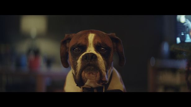

Meet Buster... 

...And his friends

The third and most important reason why I personally adore this year's advert is due to the fact that The Wildlife Trust are this year's charity partners for the campaign and will receive a 10 per cent of every £15 soft Buster or £12 soft Halle the hedgehog, Betsy the badger, Otto the fox or Sid the squirrel sold. This is something SO important and that I'm all for. After all, animals are just as important as us and deserve to be treated well - especially at this time of the year.

Craig Inglis, customer director at John Lewis, said "2016 has certainly been quite a year, so we hope our advert will make people smile. It really embraces a sense of fun and magic, reminding everyone what it feels like to give the perfect gift at Christmas".

My thoughts of the story behind this advert was amazing, and of course John Lewis have also created Buster pyjamas, Buster's Christmas - a children's storybook and you can download Buster images on SnapChat to transform faces into a dog face!

What's been your favourite Christmas Ad this year?

Brandi Kristine

Photo Credit: Google Images, Youtube 

Share:

Monday 28 November 2016

Vogue Editorial: Let's Dance

Editorials have always been a great interest of mine, I just love staring at them for hours on end! Today my lecturer gave us our final formative project which is the Execution stage - we was asked to do a DIY photoshoot and produce three high quality photographs.

In groups of about 5 or 6 we was allocated a creative concept taken from existing editorial shoot from the Vogue Archive. My group was given the Vogue Editorial: Let's Dance - May 2004 photographed by Corrine Day. I wasn't very familiar with Corrine Day so I went away and in my own time researched her style and movement.


Corrine Day is part of the Realist Movement, she tells a story of reality rather than fantasy throughout her photoshoots. Her style is very grungy glamour which you can see from the above images. The Let's Dance Editorial almost feels like the backstage of a dance show. The colour palette is very moody and pale, you can see this by the model's face expressions and body postures. As I researched more in depth, I realised Corrine Day could've been inspired by many different movements such as  dance - Guy Bourdin and Nick Knight or Art - Toulouse'-Lautrec (1800s).

This editorial reminds me of the movie Moulin Rouge and what I think Nicole Kidman and her dancers' dressing room would look like.


As part of our project, we got the opportunity to re-create this editorial, we also had to incorporate a fashion accessory we were given by our lectures. We was given a hand bag (at first I thought we was given glasses and I nearly had a meltdown!) and I couldn't of been happier. I will be posting images of our final 3 photographs in a few days. 

I really wanted to express my feeling and thoughts about the editorial I was given and I can't wait to start shooting as I think this will be my favourite project out of all formative projects that we've been given!

What do you think about Vogue's Editorial: Let's Dance? Tell me your thoughts and feelings in the comment box and I'll be happy to respond!

Brandi Kristine 


Share:

Sunday 27 November 2016

High End Vs High Street

After a bit of thought, and a group discussion with my flatmates (yes! I talk about fashion in University and out!), it came to light there are only so many fashion narratives around. Brands constantly keep re-using the same stories, just with different market levels. 

Just to give a few examples, we have...

Traditional Heritage: 
Ralph Lauren 'Iconic Style' Campaign 2016
Reiss Autumn/Winter 2014

Humour & Wit:
Kenzo Autumn/Winter 2014

River Island Spring/Summer 2012

Romantic & Heavenly:

Chloé Autumn/Winter 2011

Whistles Spring/Summer 2011
The similarities are quite obvious!

The images I chose for Romantic & Heavenly have a definite fairytale feel, they both use muted nudes and give an element of movement. Chloé's campaign in particular came off as a twisted campaign, as though the two models were running away from something or perhaps being chased (you can see this through the movement in the image).

Whistle's campaign is the exact opposite, as soon as I saw this image I thought maybe a ballerina rehearsing for an upcoming show or re-invention of the Kendell Jenner's ballerina photo shoot for Vogue España - October 2016. The model is posing elegantly and the overall colour palette is much brighter than Chloé's.

Now I've shown you how obvious fashion narratives can be you'll start noticing them everywhere!

Brandi Kristine

Photo Credit: Google Images


Share:

Thursday 24 November 2016

Creative Concept: Presentation

Hi! So my tutors give us no days off and I've currently been doing my third formative project The Creative Concept. All of my formative projects are group based and we were all split into groups of 5 or 6.

For this project, we had to complete 2 tasks; 1 individual , 1 group. Our individual task was to write a visual analysis of a fashion photographer. It's a 750 word document which had to be annotated, illustrated and referenced (http://brandikris.blogspot.co.uk/2017/01/creative-concept-visual-analysis.html). For the second part, we had to create 3 mood boards communicating the Creative Concept of a collaboration between a brand and an everyday product. 

My group was given the brand Land Rover and our product was Colour Cosmetics.

Mood board 1: Brand and Product

Mood board 2: Connotations, Connections and Associations

Mood board 3: Creative Concept for the collaboration

Firstly, we had to understand the brands identity and where we saw that particular brand. As a group, we went away and thought about what we thought Land Rover and Colour Cosmetics represents. We found a few images which associated perfectly with the brand and the product.

We then went on with mood board 2 which we included what is the brand? What's the personality? (connotations and semiotics). By this point, we wanted to incorporate our creative concept which was men's make up. We used keywords to help the audience understand the brand much more. Land Rover is known to be very authentic and a British heritage brand. Make up is far too girly so we decided we'll do skincare as well as make up. 

All of our products included: Beard wax, BB cream, oil neutraliser cream, contour stick- dark, medium and light, concealer stick, soap, face and body exfoliant and a mani pen (in other words a manicure pen). Even though all our products came from Colour Cosmetics, our packaging would be very organic and authentic - we thought of a great idea wrapping each product in newspaper or a rugged material to represent more of a mans product. 

And that's it! I hope you enjoyed my brief description on my project, on Monday we will be set our final formative project for this semester (Gosh! University is just flying by!). 

Brandi Kristine   


Share:

Wednesday 23 November 2016

The World of Gucci

Hi! Gucci is an Italian luxury brand of fashion and leather goods. I wasn't the biggest fan of Gucci until I started getting older, now my love for this brand just keeps increasing. To me, their greatest decision was making Alessandro Michele the new creative director. As a student, I can't afford to buy their most expensive pieces but I have been gifted some accessories and even a hand bag (thanks mum!).

Over the past years, I have been gifted a leather belt with a double G buckle, a GucciGhost Pouch, Women's Gucci Tian Slip-on Sneaker, GucciGhost Leather Tote and Gucci Web Slide Sandals, most of which were birthday presents (I must admit, I am a tad spoiled - being the only girl in my family!)

This year, I gifted myself with the Gucci Web Slide Sandals. The packaging looked modern and clean. I was really happy coming home to this little beauty!
Last week, in our seminar we looked at multiple brands and all of the different ways that brands say who they are. We were put in groups for our Creative Concept project and this was a little activity to get us started. In my group we had the brand AÄ“sop.

Mind maps of the brand AÄ“sop. First thoughts of the brand.

Looking into more depth - Target Consumer, the brands 'Big Idea', Interior of flag ship store.
I really enjoyed this activity and because I loved it so much, I thought I'd share the information with a different brand of my choice. Without even realising it, there are a mix of design elements that formulate the brand Gucci:


Logo:

Colour/Tone:
Elegant and grounded statement of colour when used on it's own,
but a strong accent to many other colours 

A refreshing and revitalising shade


Key Product:
Hand bag: Desire, Quality, Exclusivity


Message/Gesture: 
Glamour, Luxury, Sophistication


Geographical Location:
An entire country full of inspiration
I think the breakdown of the brand really puts into perspective of how good Gucci is at communicating to their consumers even without being outright with their brand name. When you see green and red strips you'll instantly think of Gucci. When you think of GG you think of Gucci. When  you see a sexy, topless model in an advert, you think of Gucci.

They are a brand who have totally reinvented themselves with the little help of Alessandro Michele. I have been told that before him, people would think of Gucci as quite tacky (which I agree with entirely!). Michele bought the romance, quality and taste back in Gucci and quite frankly I'm loving everything he's doing! 

What do you think?

I'll add a link to the Gucci website if anybody is interested in have a look at their new collection: https://www.gucci.com/uk/en_gb/

Brandi Kristine

Photo Credit: Google Images, Gucci, Pinterest, Pantone, Brandi Monteiro
Share:

Tuesday 22 November 2016

Trend Alert: Personalised Accessories

Hi! Ever since I've arrived at University I've seen personalised EVERYTHING whether it be online or students phone cases, laptop cases, handbags, shoes (and the list goes on and on). 

My closest friends are totally obsessed with this trend, I pretty much had to block all personalised websites off her laptop because its getting out of hand!

iPhone Cases

Luxury Hand Bags
Trainers


Personally, I wasn't a big fan but I think I'm warming up to this trend. It might have something to do with everybody having personalised accessories and I just think to myself 'why do I want something that everybody has?'. I first saw the trend on British Vogue on their 'In the bag of..' short videos, this particular episode starred Sarah Harris and I must say she loves everything personalised.

With that being said, I think that this trend will be staying around for some time, I can't leave my flat without seeing a few girls walking down the street with personalised necklaces, handbags or even socks and also how much social media is advertising them so much right now! 

Are you a lover or a hater?

Brandi Kristine 

Photo Credit: Google Images, Louis Vuitton,  

Share:

Monday 21 November 2016

Creative Concept: Visual Analysis

Hi! About a week ago, we were set another formative project which had two parts to it. The first part we had was to create 3 mood boards communicating our creative concept and the second part an individual written visual analysis of a fashion photograph.

This task really helped me to develop my ability to analyse fashion images. The fashion image which we were allocated was by an important fashion photographer and either from a fashion shoot or an advertisement.

I was allocated a fashion image taken by the great Annie Leibovitz. I deconstructed the image, analysed the visuals and interpreted what I could see.


Alice in Wonderland For Vogue By Annie Leibovitz

I began this essay with an introduction to what I've been asked to do in my brief and how I will be deconstructing the image above. I then went on and discussed my interests about the fashion photographer Annie Leibovitz and the key moments of her career. I went into a brief description about the image i.e. what I can see and the surroundings (this may sound very easy but it was not!).

After about a 15 minute break, I carried on discussing formal analysis and a deeper interpretation of the fashion image. Of course, for our first essay of the semester I wanted to nail it and I do believe I might have OVER thought this and waffled quite a lot! Nevertheless, I was really happy with this project because it's not in my comfort zone and I was challenged - which I really enjoyed.

I'll share some screen shots of my Creative Concept: Visual Analysis essay below:


There it is! I hope you have good eyes to read that small print! I'll be updating you guys with my Creative Concept: Presentation shortly so keep your eyes out for that!

Brandi Kristine 


Share:

Thursday 17 November 2016

The Tale of Thomas Burberry

Hi! It's that time of the year again, your favourite stores have gone all out with their visual merchandising and shop front windows! Those keen family members have already started telling you what they want for Christmas and the much anticipated Christmas adverts have finally been released.

I hate adverts! I'm always the one to run off and make myself a cup of tea whilst those long adverts casually disrupt my quality Hollyoaks! However, Christmas adverts... I see them more as a short movie! Their fantastic but one has caught my eye in particular.

Burberry Logo

Domhnall Gleeson plays Thomas Burberry

Burberry is a brand that I don't really pay any attention to. However, in today's seminar we was discussing brand adverts and my lecturer played Burberry's Festive Film 2016 (and thank God he did!). This advert felt like a trailer to a movie, I don't think I've ever watched an advert so intensely! The narrative, the cast, the music - everything was perfection.

I feel as though this advert has a great balance of educational and entertainment factors. It shows the making of their infamous trench coat which soldiers wore during the war and how Burberry supplied the protective clothing to Antartica. It's great to think that I've learnt that in just 3 minutes whilst watching an advert! 

I will put the official video below for anybody who is interested in watching the advert and feel free to leave a comment telling me your thoughts!

The Tale of Thomas Burberry: The Festive Film 2016


Brandi Kristine

Photo Credit: Google


Share:

Wednesday 16 November 2016

Role Model: Stacey McKenzie

Hi! Stacey McKenzie is definitely one of my favourite supermodels of all time, and probably the most amazing model to have ever come into this fashion world. For a 26 year old women, she is unbelievably gutsy and she is so thankful and passionate about her modelling career. On the new episode of America's Next Top Model Season 23, Episode 2 "Lights, Camera, Catwalks" she taught the models how strut what their mothers gave them!

Read the Instagram caption... Need I say more about how motivational she is? 

After looking at the image above, it reminds of the great speech she told the ladies on the fashion reality show, how girls need to stick together and motivate each other. After seeing how amazing Stacey's story was, I just had to write a post about her. She's what the modelling world needs! Not all that bitchy and cattiness towards one another. 

For such a young women I believe she's nothing short of incredible, telling her emotional and discriminating story I hope empowers and motivates other young women all over the world.

Keep doing Stacey! Everybody loves you!

For anybody interested in watching the episode and hearing her story, I'll leave the link below:
ANTM S23E2 http://gorillavid.in/6gxdy96jv47w

Brandi Kristine 

Photo Credit: Instagram
Share:

Tuesday 15 November 2016

#BoF500

Hi! So I was scrolling down BoF500 (Business of Fashion for those of you who don't know what 'BoF' stands for) and I found a pair of Portuguese fashion designers named Marta Marques and Paulo Alemida. I have to say firstly, I didn't know who they were and why they were on the BoF500 list. But after doing some FBI researching, let me tell you why they are!

The pair are known for the innovation with distressed denim and are rising stars of the London scene. Last year's winner of the LMVH Prize for Young Fashion Designers (which is pretty cool!), the designers received a whopping 300,000 euros and a yearlong mentorship from the LMVH group. 

Open Ceremony first discovered them at their very own first collection in 2011 and the brand has stockists in global capitals such as London to New York, Sydney to Seoul.


Paulo Almeida and Marta Marques
 Marques and Almeida met studying at the CITEX fashion school in Portugal, then moved to London in 2009 to take up internship with Vivienne Westwood and Preen. They both studied at the prestige University Central Saint Martins where they both presented their final collections together. The talented pair were awarded with the NEWGEN sponsorship from the British Fashion Council and Topshop. Their work as been featured in British Vogue, Elle UK, Vogue Paris, Twin, Tank, i-D and Dazed and Confused. 

Marques Almeida AW16

Marques Almeida SS16

Marques Almeida SS16

Marques Almeida AW16

I love BoF500 because you get to introduce yourself to new designers and broaden your knowledge further with the fashion industry. This pair have really achieved great things together and deserve their spot on the BoF500! (plus they're from Portugal and that's were I'm from, so it makes me like them just a little bit more!)

Link to official Marques Almeida website: https://www.marquesalmeida.com/

Brandi Kristine

Photo Credit: Google
Share:

Monday 14 November 2016

2016 Glamour Women of the Year Awards

Hi! I honestly couldn't wait to post this update! This evening, I watched my favourite Award show of all time! If you didn't catch the featured live story feed on your SnapChat then quite frankly you've missed out! 

GLAMOUR Magazine in my opinion is the definition of class when hosting events. I just love the idea of gathering a bunch of successful women together and celebrating one another!  

I think the absolute highlight for me was when Rashida Jones introduced Women of the Year honouree Nadia Murad, the young Iraqi women who escaped enslavement by ISIS and has not stopped fighting justice ever since.


Another huge moment of course Amy Poehler introduced Bono (for the first time, the awards honour a man!) and made light of the fact that he was a controversial choice for Women of the Year honour. He mentioned that poverty overwhelmingly affects women, and that they face discrimination every single day. His speech was awe-inspiring. 


He got very serious when he talked about his wife and daughter, and the powerful women who have made him realise that there is not a single country on earth where women have the same opportunities as men. For a man to feel so passionate by this statement shows incredible maturity - I think he's fab!

Brandi Kristine

Photo Credit: Google, Getty Images for Glamour  

Share:

Friday 11 November 2016

Trend Analysis

Copper Shadows. Rather than a traditional black smoky eye, the upgraded version features a touch of copper shimmer in the centre - I personally feel it's perfect for brown eyed girls. 


The image above along with several others have been doing their rounds on social media for a while now and even I have been desperately trying to up my eyeshadow game. 

A lot of you may not no but 90% of the time I never wear make up, however I own too much make up for my own good! Last week, I bought my first ever eyeshadow palette (obviously at the airport where it's cheaper!) and I noticed that copper tones are really in!

I went away and decided to do a little bit of research on the make up trends in 2016 and no shock copper shadows was obviously one of this years main focus. I looked at a range of secondary resources, whether it be WGSN forecasts, media coverage, fashion press or magazines. After researching, I discovered that the trend is more a Autumn/Winter look which sides with potential colour tones Autumn brings us. 


I really enjoy doing trend analysis because it gives me a better insight on the trend (so if anybody asks me, I have a full background check!).

Brandi Kristine 

Photo Credit: Pinterest, Desi Perkins
Share:

Thursday 10 November 2016

The Big Idea

Hi! As a lot of you may know by now, I'm currently studying FCP at Nottingham Trent University and today was the day I got set my second formative project. Again, this was a group effort and we all got split into groups of 4 or 5. The Big Idea project was solely based on the environmental and social impact on the Fashion Industry.

As a group, we all discussed the most important points and which we would research about in more depth and these were:
-  Ethical and environmental issues in the fashion industry
- Best practise, businesses and individuals who are tackiling the issue in a positive way
- Campaigns that have successfully raised awareness about these issues
- The best way of targeting students


We all decided through Guerilla Marketing we would be able to raise awareness of ethical clothing and as a result get consumers to change 20% of their wardrobe. With that being said, we decided to name our clothing #NOBLOODONOURHANDS thinking it would be bold and catch the attention of students. We aimed to target students in their everyday life by placing statements of awareness on sides of University buildings, the Student Union and within Student Accommodations (the message is continued everywhere e.g. student welcome packs, T-shirts and coffee cups). Another idea thought was placing bloody footprints while standing in various stores with "pregnant women are made to stand up in factories as punishment".

Primary and Secondary research was a very big factor within this project as it was vital for us to know how students really felt about environmental and social matters within the fashion industry. Also, if they like or disliked our ideas and their thoughts of how we could improve it.

I must admit this project made me think! It was a very big eye opener and I'll definitely think before I buy!

Brandi Kristine

Photo Credit: Brandi Monteiro 

Share:

Wednesday 9 November 2016

Vogue Vs Bloggers

Hi! Once Milan Fashion Week Spring/Summer 17 had come to an ending, a few key members from Vogue editorial team gathered round to write down a few words to highlight the week's events. 


Susie Lau and Bryan Yambao

The discussion started off as review of the Italian's fashion capital's biggest collections and trends, quickly turned into Mean Girls canteen banter, the editors began digging their well-manicured claws into bloggers and their practice of wearing "paid-for" outfits at fashion shows.

The editors of Vogue managed to call these bloggers everything from "sad", "embarrassing" and "pathetic" and they should "find another business" (Meow!). Susie Lau (aka @Susiebubble) and Bryan Yambao (aka @Bryanboy), two of the industry's most popular bloggers, responded to the Vogue editors with a bunch of tweets on popular app Twitter. 


I think that Vogue's patronising and malicious remarks lead many readers and fans to criticise their outdated views on how the fashion industry actually works now. Bloggers use their exposure by lending exposure to brands in exchange for money. Not to mention this whole "you can't sit with us" attitude in fashion is pretty petty. Get with the picture Vogue!  

Brandi Kristine 

Photo Credit: Twitter, Google 


Share:
© Brandi Kristine | All rights reserved.
Blogger Template Crafted by pipdig